Hallway Remodeling Project
Gramercy Park
We are excited to reveal details about a design we completed for a condominium in Gramercy Park. The seven-story building was home to a brewery for over sixty years before it was converted into a residential condominium building. The units in this one-of-a-kind structure retain many of the brewery’s original details including wood beam ceilings, exposed brick walls, and massive north and east facing windows. The building’s lobby was upgraded in recent years to have a modern feel. The corridors, on the other hand, were not renovated along with the lobby and they continued to retain their traditional style. The owners contacted us looking for a typical hallway remodel with a little edge.

Our team was retained to perform a complete ceiling and hallway redesign with all new finishes and fixtures. The biggest concern of the client and the main design challenge for this project was the marriage of the mismatched ceilings of the east and west wings. Because the condo was composed of two different buildings, the ceilings were dissimilar in each wing. The owners wanted as much unification as possible with the inconsistent ceilings.
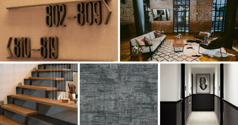
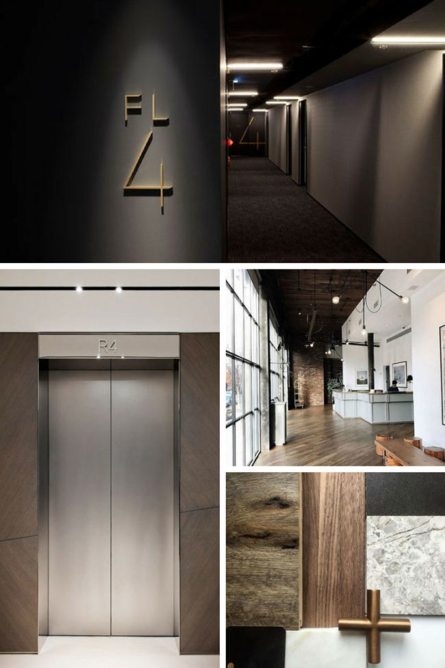
Initially, we showed the client inspiration images of Wythe Hotel in Brooklyn. The owners reacted very positively to that style. Based on the owner’s input and feedback, we decided to go with a soft, industrial, and modern feel in the hallways to enhance the existing character of the building.
Once we discovered the amazing features of the apartments, we immediately knew that we wanted to build on and play off these amazing elements. We thought it would be a great idea to bring some of the flavor of the individual units into the hallways. Thus, we opted for a wood panel treatment at the elevator landings to relate the exposed wood beams in the units to the hallways. We chose a modern chair rail, carpet pattern, and color palette. Additionally, we custom-designed signage, mirrors, wallcovering, and benches. We brought in bronze and steel accents as much as possible to mimic the steel holding the beams together.
The ceiling on the west wing could be described as possessing a dated architecturally-angled appearance which not only created dark spots in the hallways but also displayed a stark difference from the east wing’s normal horizontal ceiling. Fortunately, we found that there was two feet of extra space above the angled ceiling and we advised that it be flattened as well as raised to the allowable maximum height.
The current hallways are truly not a representation of the amazing character that the individual apartments hold. We cannot wait to start construction on the hallway remodel and watch this condo develop into a first-class building.


