Flat Preloader Icon

Architectural Design Firm

Interior Design Blogs NYC

Find out more about ALine Studio. Check out our blog posts for project details and photos.

Palm Beach Redesign: From Mid-Century to Modern-Day

Interiors, Residential, Residential Interior Design|

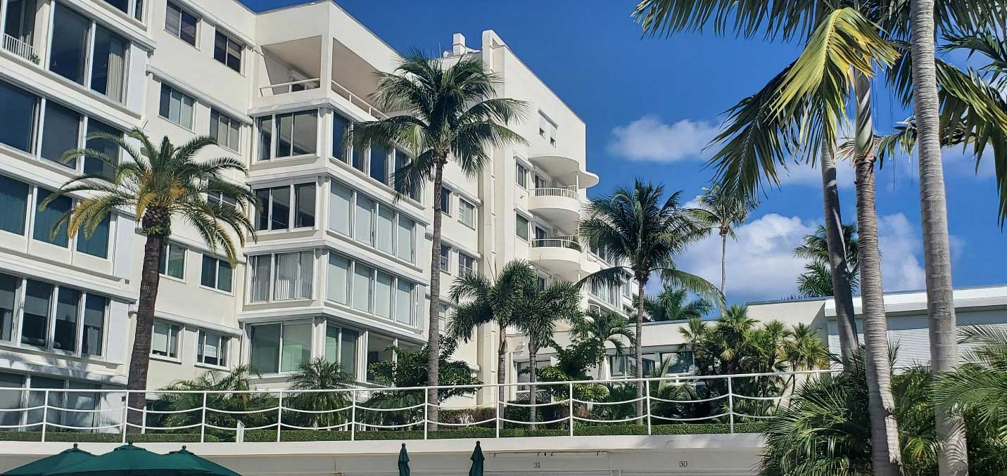
Recently ALine has had the pleasure of working with a beautiful condominium residence in sunny Palm Beach, Florida. Built in 1954, the building was initially opened as a hotel, and later converted into over 200 residences, in the early 70s. As a post-modern building created in the heyday of mid-century modern design, the original design included terrazzo flooring, muted tones, graphic shapes, and the integration of indoor and outdoor motifs. ALine worked closely with the building owners to create a design scheme that would honor the elegant spirit of the building but endow it with a more durable and sophisticated feel. A few different redesigns for the condominium common areas had been implemented over the years; but the building owners sought to both address the wear and tear on their building as well as the outdated feel of these remodels. Moving beyond the easily dateable floral patterns, or the later redesign featuring a geometric motif that quickly lost its appeal to residents, the design team at ALine aimed at a new palette that will age beautifully, and that will impress residents and remain palatable for years to come. In particular, the project has a focus on the accessibility and aesthetic functionality of transient spaces, such as hallways and corridors. A unique aspect of this project is the lengthy commute for residents between the elevator landings and individual apartments. It was important to realize a space that would be comfortable to walk through. In the words of principal designer, Lisa Patch, “Hallways are a pathway to your home; we want to make that journey enjoyable.” Exterior mosaic detail that inspired the new design. The design elements ALine created sought to integrate the beautiful waterfront views of Palm Beach with its interior spaces and create a synthesis [...]

Set The Mood With Paint

Condo and Cooperative Interior Design, Lobby Interior Design|

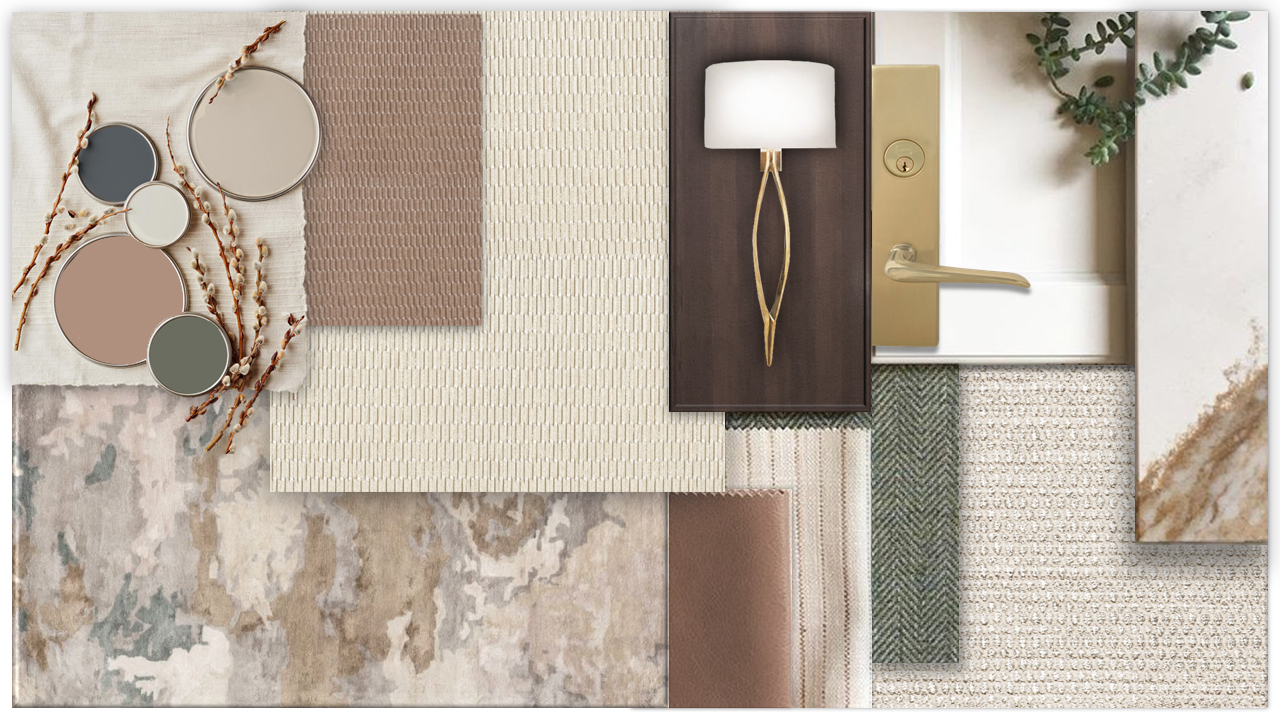
Sherwin Williams selected “Redend Point” SW 9081 as 2023 Color of the Year, and it pointed to a shift we are seeing in interior color palettes. Cool, crisp grays were dominant in past years. The swing towards greige and warmer tones invoke calm and restorative effects. In many areas of life, we are encouraged to take time for mental health and embrace the present. During the COVID lockdowns we realized how much the space we are in can affect moods and productivity. Especially in the hustle and bustle of New York City, the public spaces are turning towards an oasis, an escape. At the International WELL Building Institute, their major focus is on how spaces can affect well-being. Nourishing Color Using colors with intent can subconsciously create an emotion or action. As interior designers we are looking at palettes, how a space functions, and also the purpose of the space for the end-user. In Sherwin Williams’ schemes, we see how “Redend” can energize a space, but also create a calming effect depending on the textures and colors around it. A complementary green can create a livelier feeling, while leaving the surrounding space white will allow “Redend” to warm the room. It also acts as a neutral to become the backdrop for layering dark & light tones with the design scheme. At ALine Studio we look to endless sources for inspiration and are excited to see this trend toward warmer colors. Especially within our multi-family projects, where home has become a hybrid workspace and personal space, we see clients looking for an inviting, comforting feel to the public areas of their buildings.

Lobby Package Storage for NYC Condos & Co-ops

Condo and Cooperative Interior Design, Lobby Interior Design|

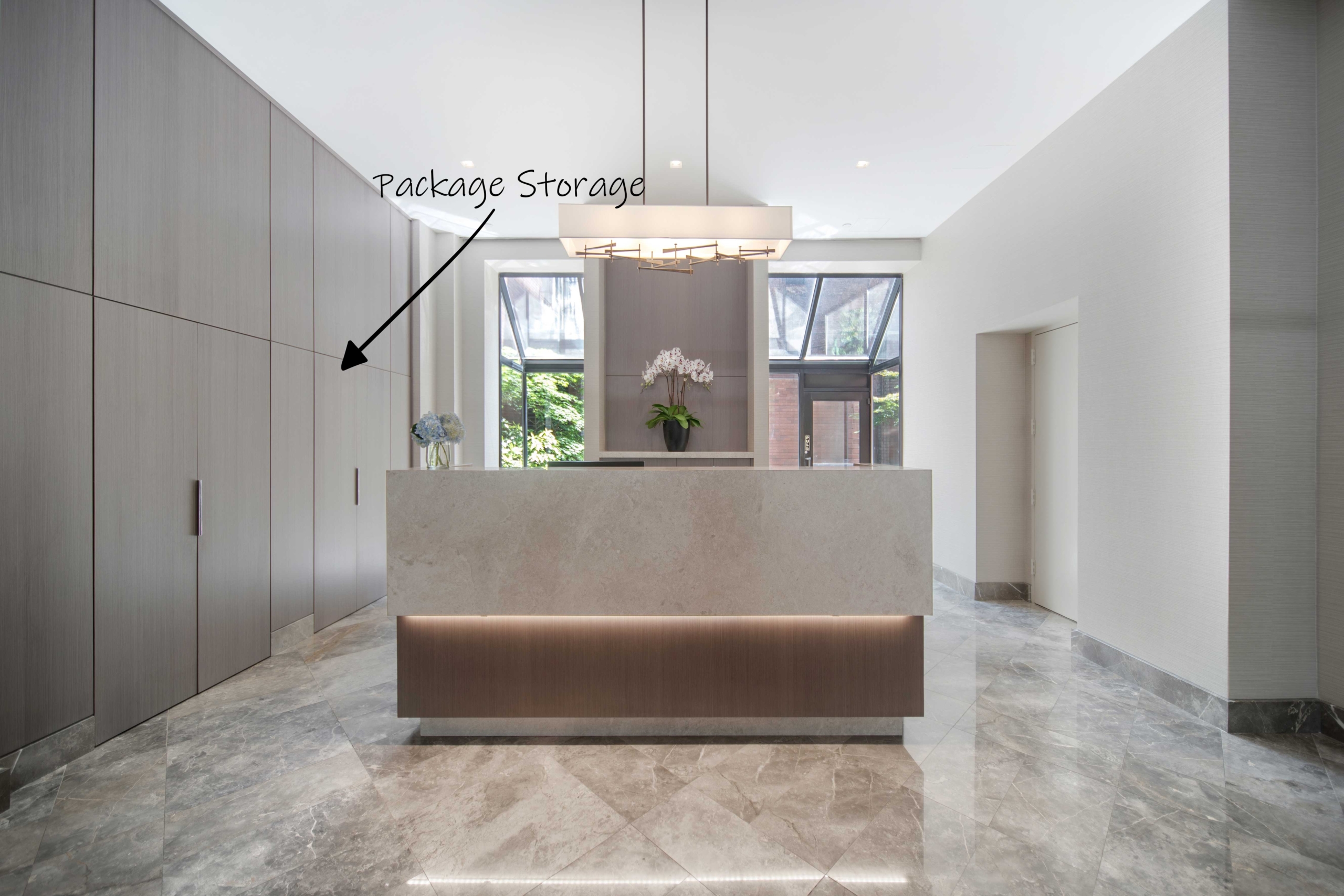
The explosion of online shopping over the past decade has significantly improved the quality of life for many. Not to mention, ecommerce was a major life saver during the peak of the pandemic. While this trend has made life more convenient, it has also produced an unforeseen issue in high rise buildings throughout New York: a never-ending stream of packages. This dilemma will presumably worsen as time progresses and people become more comfortable with ordering online. The pandemic has already accelerated the migration to online shopping. In fact, ecommerce sales were up 44% in 2020 compared to 2019. 1441 Third Avenue One of the biggest pain points that we address for our clients is non-existent or limited lobby package storage. Many times, buildings are left with no choice but to store their packages in the lobby for everyone to see. Not only does this cause an eye sore but it can also lead to package theft. Likewise, if there is no cold storage, some deliveries such as medications or groceries may perish. Over the years, the ALine design team has worked with numerous clients on expanding and/or adding lobby package storage including several with refrigeration. We commonly develop hidden package closets by blending the doors into the new design color palette. We are able to create a variety of colors and looks based on the aesthetic that your building desires. Additionally, we specify adjustable shelving that can be rearranged or removed altogether so that a variety of package sizes can be accommodated. No matter the size or layout, we can create a storage solution to address your building’s exact needs. 235 East 87th Street 207 East 57th Street 75 Henry Street Wall Street Condo Birchwood Towers - Toledo [...]

Wallcovering & Fabrics for Lobbies, Hallways, or Amenity Areas

Amenity Space Interior Design, Hallway Interior Design, Lobby Interior Design|

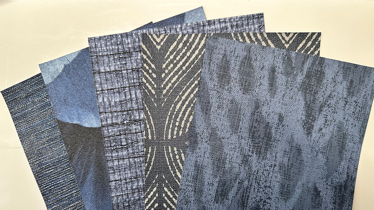
Elegant Designs to Combat an Ugly Virus Wallcovering & Fabrics for Lobbies, Hallways, or Amenity Areas There are countless wallcovering options available on the market however we primarily recommend Type II vinyl wallcovering for public spaces because of its durability, cleanability, and customization options. All Type II wallcoverings are manufactured to meet or exceed minimum physical and performance characteristics set forth in Federal Specifications CCC-W-408. Within these legal standards, there are requirements for wash-ability and scrub-ability among many other specifications. While Type II wallcoverings must be cleanable by law, this does not imply that the product can be cleaned with bleach or other similar harsh chemicals that are known to kill COVID-19. Because of the pandemic, many manufacturers have begun to offer bleach cleanable and antimicrobial wallcoverings along with furniture fabrics. In order for a material to be considered bleach cleanable, it cannot weaken or fade when exposed to diluted bleach. If your building is interested in material that can help combat the spread of COVID-19, we can help you navigate through the overwhelming amount of choices to find the right solution for your building. We can create any color, pattern, or texture that you can imagine using the appropriate substance that is unique to your building’s specific needs and budget. 1441 Third Avenue - Bleach Cleanable Material on Tan Sofa Washable Wallcovering & Fabrics Elegant Hand Sanitizer Stations for Lobbies, Hallways, or Amenity Areas Hand sanitizer stations were fairly common before the pandemic but now they are practically everywhere. This is great for personal hygiene however the appearance of the standard station is typically not chic nor glamorous. We were thrilled when we discovered an attractive alternative to the standard “medical office” sanitizer dispenser. The upscale hand sanitizer stations are [...]

Social Distancing: Designs for Open & Shared Spaces

Residential|

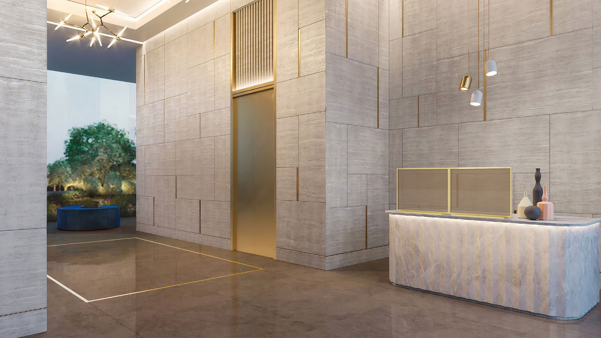
Social Distancing: Designs for Open and Shared Spaces Front Desks & Countertops for Lobbies & Amenity Spaces While there are numerous types of materials that can be used for countertops and custom reception desks, a non-porous material would be the easiest to clean and maintain. In particular, quartz and soapstone are the best options, if cleanability is the most important factor in your design. We often recommend quartz in many of our projects due to its durability, versatility, and beauty. Because quartz is non-porous, it is considered more sanitary when compared to marble or granite. Without holes or pores in the material, microorganisms and liquids can only stay on the surface. As a result, quartz is easier to disinfect and also stain resistant. Considering that quartz may not fit into every building’s aesthetic or budget, there is the option to apply quartz to the writing surface of a desk only. Additional ways to combat the spread of COVID-19 with front desks include the use of partitions. There is the choice to add a removable standard partition to a custom desk so that it can be detached in the future, once the pandemic ends. Further, there are also upscale partitions that can be used in place of the ubiquitous plexi-glass dividers. 235 East 87th Street - Custom Front Desk Made of Marble & Metals w/ Quartz Writing Surface Covid-Conscious Front Desks & Countertops Single Occupancy “Pods” or Flex Amenity Spaces Post COVID, we expect that telecommuting will continue to be prevalent. As such, we foresee that there will be demand for either flexible coworking spaces or single occupancy pods within residential buildings. The latter would certainly be safer as the pods would be completely separated units. However, this option may not be accessible [...]

Co-op Corridor Redesign on the Upper West Side

Condo and Cooperative Interior Design, Hallway Interior Design|

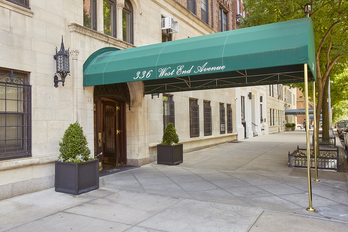
Co-op Corridor Redesign on the Upper West Side The ALine Studio team had the great privilege of completing a corridor redesign at 336 West End Avenue. This remarkable 20-story pre-war residential building is located at the corner of West End Avenue and West 76th Street in Manhattan. Converted to co-op in 1972, we found much of the décor from the Art Deco period had been preserved in the common areas. The corridor walls were the original plaster and were cast with ornate emblems of land and sea, often abstract in nature. Throughout the nearly 90 years of its existence, attempts to skim coat the walls while preserving these beautiful bits of the building’s history had left these emblems misshapen. Along the top of the walls was old traditional picture rail, and above it the coax and fiber optic wires were visibly exposed. The existing baseboards were a thick heavy terrazzo, much of which had been painted many times. The fate of these historic ornate walls was a contentious part of this project for the Board. Our team worked through much of the design process without a cohesive plan for the corridor walls. The first design proposal set forth a plan to preserve the existing walls and repair the cast emblems. We looked at various options to employ preservation strategies such as gilding to paint and highlight these delicate emblems, integrating them into the new design. After many discussions and a realistic look at the existing delicate state of the walls, the expense and possible outcomes, the Board made the difficult decision to abandon the preservation option for the corridor walls. Already well into the design process, we began working with a custom wallcovering vendor to create a wallcovering pattern that would be timeless, preserve some of the historical [...]

LOFT LIFE – New York City Loft gets a Handsome Remodel

Residential|

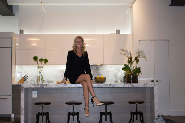
LOFT LIFE – New York City Loft gets a Handsome Remodel We have recently completed a full renovation of a bachelor’s loft in the Flatiron district of New York City. The loft is a prewar gem with great architectural bones including barrel vaulted ceilings and grand columns. The original interior was piecemealed together with no overall cohesive story. The kitchen had mismatched cabinets and an odd island while the living room and bedroom were filled with inconsistent furniture and accessories. Not to mention, the bedroom was completely open and visible from any spot in the loft. Overall, the space was not fully maximized to its potential and had a disconnected feel. The bachelor asked us to create a, “panty dropping” bachelor pad. Initially the bachelor was interested in something similar to the apartment from the movie, Hitch. After much laughter and a long serious conversation about relationship goals, the bachelor agreed that he needed something that would impress his buddies and the ladies alike but be warm enough to garner a relationship. We then got to work creating an entirely new sexy space that was bachelor chic but lady friendly. We designed a new chef’s kitchen that any man, woman or couple would love to cook in complete with top-of-the-line appliances and a wine refrigerator. Moreover, custom steel beam covers were installed above the kitchen. The purpose of the beams were to frame and the highlight the kitchen, ground it with the dark stained wood floor, and accentuate the incredible architecture of the existing ceilings and columns. We wanted to really play up that area. The bachelor originally wanted a pool table that converted into a dining table. However, we informed him a pool table would not add sex appeal [...]

New York Co-op Hallway Redesign

Condo and Cooperative Interior Design, Hallway Interior Design|

New York Co-op Hallway Redesign At the end of 2015, ALine Studio was awarded a hallway redesign project at the prestigious Park Regis high rise residential building in New York City. Built in 1974, the Park Regis building is located in historic Carnegie Hill near Central Park and has approximately 210 units and 30 stories. While the building is well maintained, it was time for an update. The Board asked for a “light, simple, residential feel”. They wanted something that would appeal to both modernists and traditionalists alike. A key design element going into the project is the addition of a coved ceiling at the elevator landing. This architectural element will have LED lights around the perimeter to provide a nice, radiant glow as you arrive on each floor. We selected marble flooring for the elevator landings which will complement the design scheme color palette and provide a separation between the arrival point and the residential corridors. We will additionally accent this area with a darker, richer wall treatment to create a sense of warmth and contrast from the lighter and brighter corridors. The key is maintaining a cohesive design between the two spaces to create visual continuity and harmony. Creating custom designs to fit the needs of our clients is one of our passions. We believe it should fit the architecture of the building as well as the client’s style and vision. For this job, we reached out to the wall covering manufacturer and worked with them on brightening and lightening the color of an already existing pattern. The manufacturer sent us the sample and to our surprise, they nailed it on the first try which makes our job much easier! The end result was a wall covering that provides a light, fresh feeling. The [...]

New York City Lavish Amenity Space

Amenity Space Interior Design, Condo and Cooperative Interior Design|

New York City Lavish Amenity Space We are nearing the completion of our project designing a luxury amenity space at the renowned address of 535 West End Avenue. This beautiful pre-war style, white-glove building is located in the Upper West Side. All of the units are either half or full floor residences that range from 3,700 to 8,400 square feet. The residents enjoy an abundance of amenities including an indoor swimming pool, fitness center, spa, game room, and an outdoor courtyard. And in just a few short months, they will have a new high-end entertaining space to host parties and events. The Board asked for an upscale, adult-only lounge in which residents could host fundraising events, cocktail parties, conferences, and meetings. This new space, originally a studio apartment off of the lobby, was completely gutted down to the concrete slabs. We started with a blank canvas! The result will be an open-concept, multi-purpose room with a conference space, comfortable sitting area, cocktail tables, bar, and powder room. The conference area features a faux fireplace of beautiful bookmatched marble, reminiscent of petrified wood. The stone is flanked on either side by built-in bookcases, custom designed with asymmetrical, yet visually balanced shelving. Tufted window seats are tucked into deep window sills that make up the elegantly curved facade of the building. Sunlight streams in to bathe the made-to-order 8’ wood slab live-edge walnut table perched atop solid brass wishbone shaped legs. The glowing coved ceilings overhead illuminate champagne leafing and is adorned with brass, Sputnik-like chandeliers. The floor is honed Blue Cielo marble with a black marble double border inlay. The border follows the curve of the window wall and allows for the eye to flow around the space and adds a tailored touch. [...]

Go to Top